Learning to make art for a game
For my whole life I’ve loved to make art. When I was a kid I used to draw a lot. I loved making comics and even made some flash animations back in the day! Sadly, as I made it through school and eventually got a job, I stopped making art as often. Maybe a few doodles here and there in my notebook, but that’s about it.
Now that we’re working on Rads and Relics, I’ve started to make art again! Though I have to admit… making art for a game is much more difficult than I anticipated. Choosing the right style, colors, level of detail, and even the right tools has all been challenging, not to mention the fact that my skills are a bit rusty. This has been my journey thus far:
The start
I started with a bunch of enthusiasm. At this point Tristan had already started development with some placeholder assets so I decided to immediately try to make a few sprites and animations. I started with a fireball.

Ehhh… not great. It kinda looks like swiss cheese?

Hell yeah, that’s way better! Okay, let’s see what it looks like in the game:

Oh… it doesn’t quite look how I expected. It looks way too small, very flat, and I don’t really see any of the details I added. This was the first roadbump I ran into, and made me realize how important the size of your assets is. Unfortunately, this has continued to be a challenge for me – visualizing what everything will look like in-game is tough when you’re working on one asset at a time.
Continuing to experiment
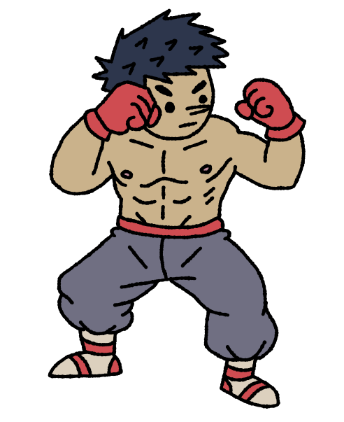
I decided to move on and try to make a character:

and a few basic tilesets:
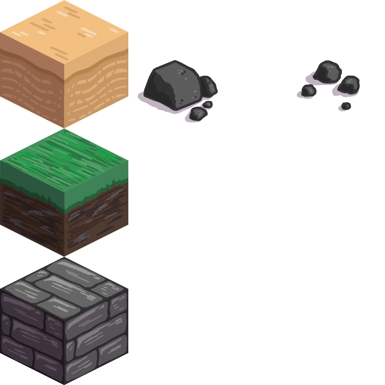 |
 |
|---|
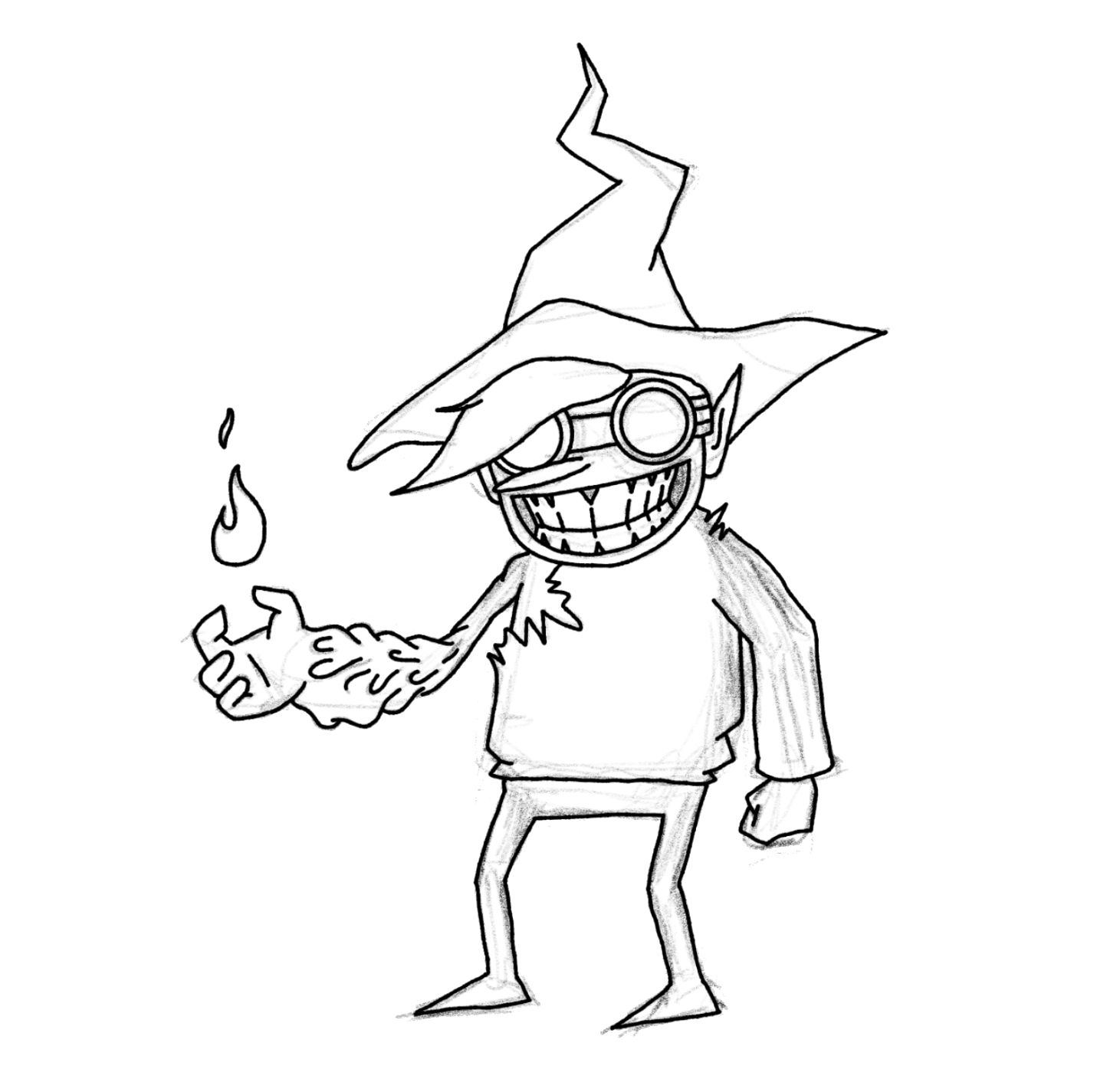
These are okay, but this is where I started to think about style. I felt like the character and the tileset didn’t really fit together. I also wasn’t super satisfied with the character design, especially the fact that the character is very flat and directly facing the camera, which doesn’t quite look the way I imagined given our isometric perspective. I tried making a second character:

This attempt was a bit better. This time I tried to draw the character in isometric perspective, which I found to be challenging! It makes me realize that I need to practice drawing more poses in different perspectives. Unfortunately, this attempt still doesn’t quite have the oomph I was looking for.
I realized that we hadn’t really defined what we wanted the style of the game to be. We had a theme but not a visual style. At this point I started trying to gather as many references as I could – anything that I thought looked cool and fit the theme. I also started to reflect on my skills, and whether or not I was capable of making something that I reached the level of quality I wanted.
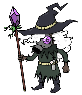
Finding my style
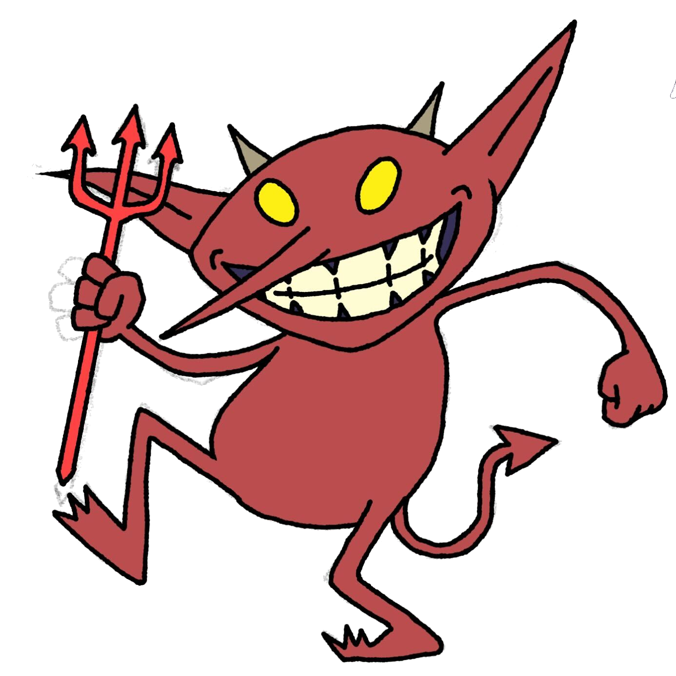
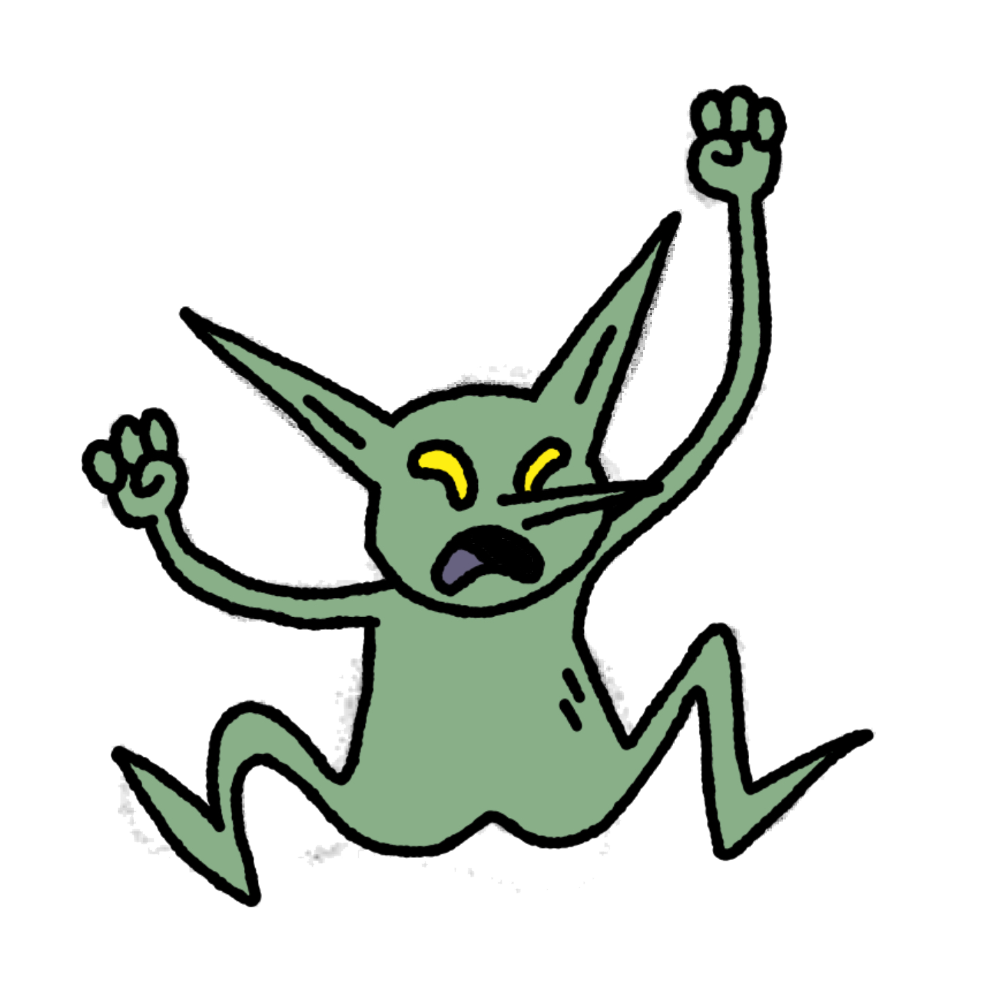
When I was younger I loved to make comics and flash animations, and I’ve always had a very “cartoony” style, somewhat similar to the style of Adventure Time. I decided to try proceeding with some character designs that fit this style:
 |
 |
|---|
 |
 |
 |
|---|
These are starting to look a bit better! With the style now better defined and some reference material, things are starting to come together.
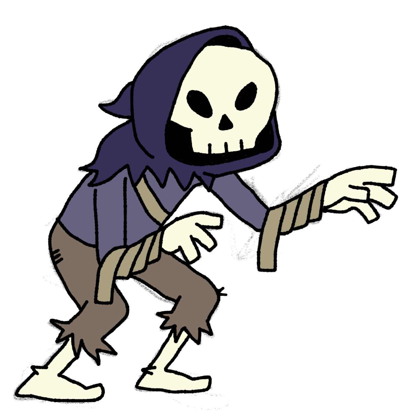
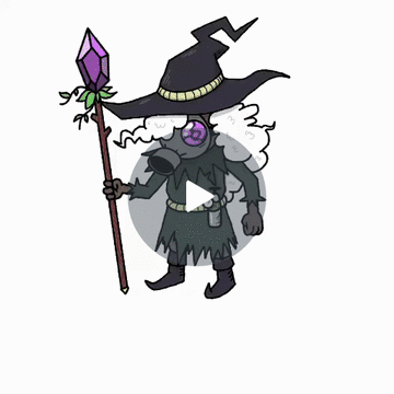
Most recently, I made a some card art for our “Move” card and another new character:
 |
 |
|---|
Check out the timelapse!
Lessons Learned
This post has been a bit rambly, but such is the process of learning to do something new. I’ve realized that this is going to be a process of trial and error and a lot of practice. I’m starting to see the vision! It’s just going to take a lot of work to get there.
With that said, here are some of the lessons I’ve learned so far:
- Consistent size, color, and style is key
- In order to make the game look cohesive, it’s important to consider things like line thickness, color, and style.
- This can be tough to do when you’re working on one asset at a time. So far I’ve tried working on a big canvas to see how everything fits together, as well as putting some screenshots into Figma just to get a sense of the overall style.
- It’s also important to avoid adding too many details. They’re hard to notice in-game and just add a bunch of visual noise.
- Use references!
- I tend to be a bit too eager to just start drawing, but I’ve realized that references really help me come up with better ideas, get a sense of form and perspective, and even help me avoid making mistakes.
- Practice makes perfect
- I’ve read online that game assets should either be (1) good enough for now, or (2) the final version. This idea has helped me forgive myself for not making something perfect on the first try. All I gotta do is just keep trying!
State of the Game
- Progress this week
- Improved card design, now with more details
- New character sprites and new enemy types
- Better UI for unit details and abilities
- Coming Up
- Status effects and spawning effects
- New tilesets and background art
- Battle system tweaks and improvements