As we’ve been prototyping, we’ve often built our UI to have the bare minimum functionality. For example, here’s our title screen at the start of the week.
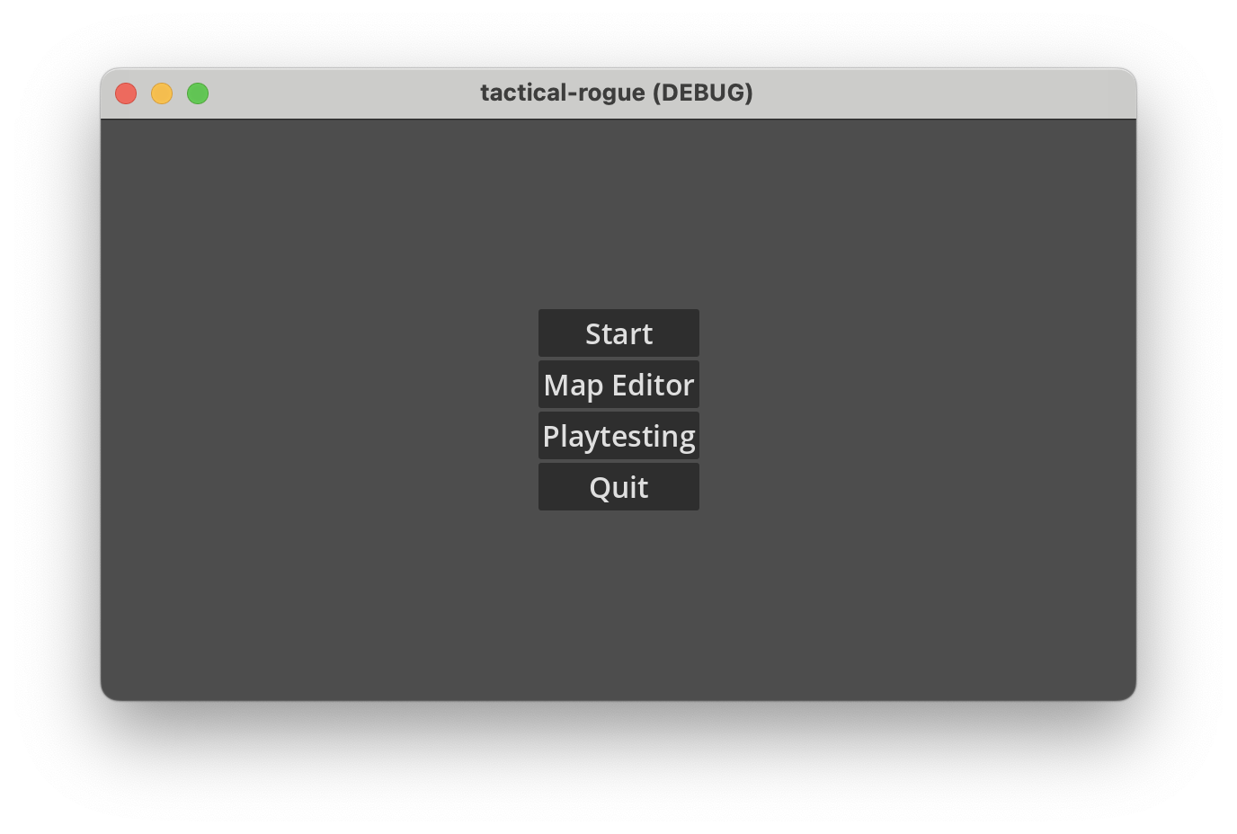
This gets the job done, and it lets us get to the gameplay. But it can be kind of a drag, when everything is a silent, monotone gray. And so this week, we’ve spent some time making upgrades to our UI and our title screen, including the following:
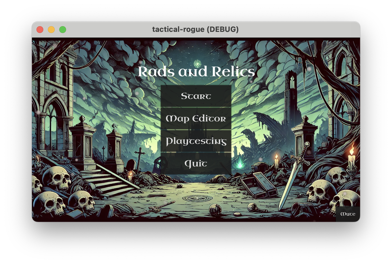
- Added new key art. This was generated with Dall-E-3, so it won’t be our final art, but it helps things feel a bit more alive.
- New “stylized” font for some UI elements. Since this font is less immediately readable, we’re keeping this localized to places where we don’t have a very dense amount of information.
- Sound design updates
- Adjusted spacing of UI elements to make better use of the screen space.
- Added dust particles on the title screen to provide a sense of movement, even with a static image.
After all of this, here’s our new title screen.

It’s still got a lot of room for improvement, but now it’s starting to feel less like a tech demo, and more like a game.
State of the Game
- Progress this week
- UI upgrades detailed above
- UI upgrades to active character selection
- Upcoming
- Tactical battle improvements: We’ve got the basics of a tactical battle, but it needs a lot of play testing and balancing to feel good This is going to be our primary focus next week.